
Showing posts with label watercolor art. Show all posts
Showing posts with label watercolor art. Show all posts
Monday, October 26, 2015
Pumpkin harvest
This painting is based on a photo I took while visiting a local nursery having a harvest festival. They had piles and piles of pumpkins ready for carving. I really focused on the shading to create texture on each pumpkin as well as to keep their roundness.


Sunday, April 26, 2015
Wild irises along the river, plein air
A beautiful spring day along the American River, I went out to enjoy the river and sun with some friends. Of course I was inspired to do some painting, with the wild irises all in bloom along the banks.
Why do I paint? I paint because it allows me to escape from work and go within to find joy. Painting creates an intimate connection with my subject, in this case, my favorite model, Mother Earth. This plein air painting done at William B. Pond is a perfect spot for demonstrating this: a quiet spot away from the bustle of the city where I can reconnect with nature.
 I actually painted this same tree cluster a couple of years ago as one of my first plein air paintings, but from a different angle, William B Pond. It is amazing to see how much my painting style has improved over the last couple of years.
Why do I paint? I paint because it allows me to escape from work and go within to find joy. Painting creates an intimate connection with my subject, in this case, my favorite model, Mother Earth. This plein air painting done at William B. Pond is a perfect spot for demonstrating this: a quiet spot away from the bustle of the city where I can reconnect with nature.
Sunday, April 19, 2015
Portrait of a pug
I recently went to a demonstration by Steve Walters and one of his tips to keep energy, passion, and spirit in a painting is to put bold colors down first as a kind of abstract under painting. I thought I would give it a try with a photo of a pug that a fellow artist, Michael Salmon, shared. I think that the colors help keep the painting whimsical and it helped break up some of the black.


Sunday, April 12, 2015
Portrait practice, sketch and watercolor
It has been more than 6 months since I have painting from a live model so I'm a little out of practice. I headed over to Patris' Studio since it was the second Saturday of the month which is when they usually have a clothed model doing a long sitting. When I got there, they told me they have not done the model on second Saturday since the beginning of the year, but they just happened to have a model doing a long sitting for another artist that was there that day. Just my luck that I showed on the right day of tje right month.
I decided to start with a quick pencil sketch, just to get some practice with proportions. I think I was off a little bit. The other artist that was there used the word "unresolved". The sketch is still unresolved!

I decided to start with a quick pencil sketch, just to get some practice with proportions. I think I was off a little bit. The other artist that was there used the word "unresolved". The sketch is still unresolved!

I decided to move on to watercolor. With an overhead spotlight, her eyes fell into dark shadow, which gave her an odd look, but overall I think it turned out well. Her eye on the right though is still... unresolved!


Sunday, April 5, 2015
gristmill plein air reworked
Sometimes after letting a painting sit for a while, I will go back and see if I can improve on it. Usually it doesn't take a month before I do this, but in the case of my Gristmill Plein Air painting, it has been longer than that.
It did not seem quite finished but I could not quite figure out what it needed. I decided to post it onto a facebook paged where fellow artists critique your work. Wow, talk about putting myself out there! There was lots of input as to how to improve it. One of the comments was that the waterline cut the picture right in half, it looked like two different paintings put together, and there was no point of focus.
So I decided to just go for it, and try to apply some of the ideas that had been thrown out there. I raised the waterline and broke it up with some grasses. I lightened the foreground a bit and darkened the background to try to create more depth in the painting. And I added a point of interest, the fisherman. I rarely put people in my plein aire paintings so this was a big challenge. He looks a little stiff but I think it works.


It did not seem quite finished but I could not quite figure out what it needed. I decided to post it onto a facebook paged where fellow artists critique your work. Wow, talk about putting myself out there! There was lots of input as to how to improve it. One of the comments was that the waterline cut the picture right in half, it looked like two different paintings put together, and there was no point of focus.
So I decided to just go for it, and try to apply some of the ideas that had been thrown out there. I raised the waterline and broke it up with some grasses. I lightened the foreground a bit and darkened the background to try to create more depth in the painting. And I added a point of interest, the fisherman. I rarely put people in my plein aire paintings so this was a big challenge. He looks a little stiff but I think it works.

Before

After
Friday, March 20, 2015
Lily pond in watercolor
This is the second challenge that I have taken on that was presented by the Google+ community Group Watercolor Painting. The concept behind the group is that we all paint in different styles, and to demonstrate this, we all paint the same picture in our own way.
I'm not sure if there is much difference between a lily pond and a lotus pond, and I took a similar approach to painting both this piece and the Lotus Pond that I painted 6 months ago. Both were from a photo, then traced onto watercolor paper. The lily pads really make or break the perspective of both pieces. This one had so many lily pads, it got a little muddled. Some turned out really well, while others, not so much. (My eye keeps focusing on the manatee shaped leaf on the bottom right) I can't even imagine Monet's garden with hundreds of lily pads.

Friday, March 13, 2015
Pheasant in watercolor
I seem to do well with a challenge someone gives me, or a competition. I never seem to win but it gets me motivated. So here is a challenge that some fellow watercolorists in the Google+ community Group Watercolor Painting gave me: a photo of a pheasant.
It took me a while to figure out where to start, but I decided to trace the outline of the bird right off the computer with pencil first, then traced it from there onto watercolor paper. I decided not to worry about the background shown in the photo, so I threw down some background color around the outline. Not sure if my choices were too close to the color of the pheasant...
After that dried, I put in the main colors of the pheasant onto the body, while leaving the neck, beak, feet, tail feathers and some of the back white. I tried to blend the colors together so it transitions smoothly from one color to the next. Then I added in some black detail. It seemed like it needed some "grounding" so I added a shadow underneath. I went back in and reworked a few areas, like the wing which does not seem to be placed quite right.

Wednesday, February 18, 2015
Gristmill plein air watercolor
 The weather here in California is just too nice to paint inside, so I took advantage of a warm February afternoon to head down to the river. My plein air supplies are pretty simple: a pad of watercolor paper, a pencil, a few brushes, my paint palette, and a cup to hold my water. I also grabbed a blanket from the trunk of my car since I forgot my folding chair I usually carry. I found a nice sunny spot on a log near the American River and started to paint. I love the little rapids flowing over the rocks but I am still trying to figure out how to convey that in the painting.
Sunday, January 4, 2015
Red Flowers in watercolor
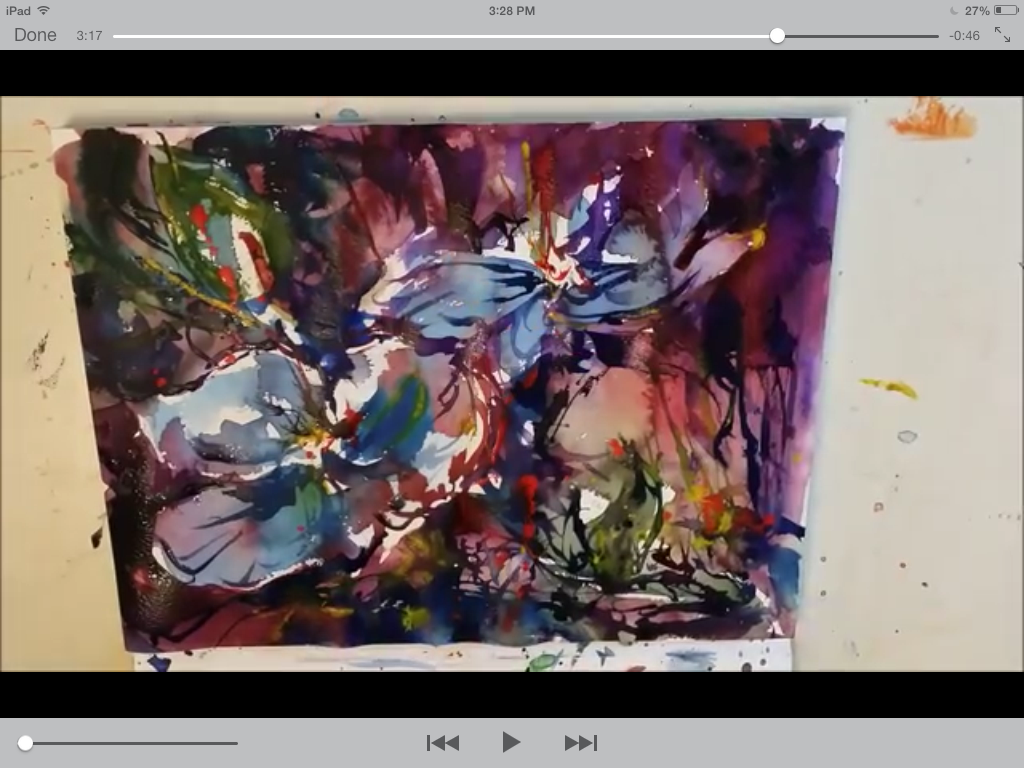
This painting was inspired by a video posted by Mikko Tyllinen on Google + demonstrating how he painted "Blue Flowers". I love how loose his painting is and how he takes advantage of watercolors' unique qualities. Here is my attempt at imitating his work although I changed the color profile from blue to red. I have put my paiting on the left and stills from the video on the right to show approximately what step I was working toward.


At this point, I feel it is almost done ,but I'm not even halfway through the video! Mikko has a way that he keeps working the painting to get more depth but as I continue, it seems to get overworked. And I;m trying so hard to keep some of those white spaces



 |
| Quick pencil sketch |
 |
| first washes going onto the paper |
 |
| working very wet, already I can see my colors aren"t as bold |
 |
| Trying to put some bold colors in, A lot of bleeding colors |
At this point, I feel it is almost done ,but I'm not even halfway through the video! Mikko has a way that he keeps working the painting to get more depth but as I continue, it seems to get overworked. And I;m trying so hard to keep some of those white spaces
Mikko states that his total paint time is 16 minutes. I took me about 30 minutes including some drying time in between. This was a great exercise in keeping my painting loose but I think I need to work on putting bolder color into my painting.
Friday, November 28, 2014
Autumn leaves, watercolor
This is my favorite time of year, and with the beautiful weather here in California, I have been enjoying going for walks along the American River. The fall leaves have slowly been turning colors, and it just amazes me how the colors just blend into each other on every leaf, each one a little piece of art!
I decided to try my hand at blending the leaf colors together. I worked with wet-on-wet to bleed the colors together, with lots of little accidents along the way...some good and some bad.
And here are the results...

I decided to try my hand at blending the leaf colors together. I worked with wet-on-wet to bleed the colors together, with lots of little accidents along the way...some good and some bad.
And here are the results...
Tuesday, November 25, 2014
Abandoned art, watercolor squares
So here are the pieces that I had created to be abandoned. I'm kind of attached to them now and I don't think they deserve to be abandoned any more. All of these are done on 4x4" squares of watercolor paper. Great for Christmas gifts or maybe I should mount them into a grid in a collage frame to display them as one piece.
Just some thoughts about the art...
For some reason I was stuck on creating negative spaces...for the lettering, the flowers, the eye.
I love the eye, but realize the challenge in portraits is not in creating one eye, but in creating a second mirror image that matches! The "imagine" piece is a bit chaotic, but I suppose the universe as well as my imagination might seem like that.


Friday, November 21, 2014
Lotus Pond, watercolor
I offered to donate an original watercolor for the Spiritual Life Center silent auction. I decided to create something new, instead of looking through my old paintings. The idea of the lotus pond actually came from a picture on their website, slcworld.org.
I think the lotus flowers turned out very well. The shape and size of the "lily pads" seem to throw the perspective off a little, but I like the textures that I was able to create on them.
What are your thoughts on this painting?
I think the lotus flowers turned out very well. The shape and size of the "lily pads" seem to throw the perspective off a little, but I like the textures that I was able to create on them.
What are your thoughts on this painting?


Framed and ready for auction.
Tuesday, November 11, 2014
Kiva beach, plein aire
There are so many opportunities to paint plein air at Lake Tahoe, sometimes I get overwhelmed. I just want to soak it in mentally, take pictures, and say I'll do it later at home. That defeats the purpose of plein air though. So on a beautiful fall afternoon, I finally decided on a spot out on the Camp Richardson pier...the beach was all shady and cold. The sun seemed to be going down really quick and the shadows were changing even quicker. I did the majority of this piece in an hour. When I was finished, I was looking straight into the sun.
My goal was to make it look like the foreground trees were all in shadow with the light filtering through. I tweaked the details a little more once I was home. I think I could have gone even darker for the shadows, but I always worry it will go too dark and lose the color.
My goal was to make it look like the foreground trees were all in shadow with the light filtering through. I tweaked the details a little more once I was home. I think I could have gone even darker for the shadows, but I always worry it will go too dark and lose the color.
The fun part of this was that every 10 minutes or so, people would be walking down the pier, stop and watch for a few minutes, make a few comments to each other about my painting and then keep walking. At first it was a little intimidating but then I got over myself and enjoyed the commentary.


Haunted house, plein aire watercolor

My perspective lines are still off a little bit...seems to be an area I need to work on if I keep painting houses. I used a couple of new techniques as well. I used a crayon on the street sign to write the numbers and letters so it would resist the watercolor. I also had to lift color off a couple of areas, which I did with a stiff damp brush. Luckily I was using heavier paper so that this worked. Otherwise the paper would have just started falling apart. I used white paint several times as well with varying success. The cob webs on the bushes just didn't show up like I wanted them to. Next time, I would darken the bushes and try scraping the webs in with a knife.
At one point I thought I was done, but then realized there were a couple more details that I could add, but eventually I just have to say, "I'm done!" Can you find the four changes I made to the second pic?


 Check out more of her work on Instagram: @autumnelizamakeup
The 4 differences are: I added cobwebs on the bushes (which don't show very well), there's another pumpkin on the right side of the porch, the bat above the new pumpkin, and I moved the base of the street sign :)
Saturday, November 8, 2014
Experimenting with watercolors
I taught a class about water coloring to my Artist Way group, focusing on different effects that can be created with watercolor. We started by talking about the different consistencies of the paint, depending on the water-paint ratio: tea, milk, or cream. Start with tea, and work your way up to cream. We discussed the nature of water always going to where it is dry...going from wet brush to dry paper, or wet paper to dry brush. I showed how to do washes and wet on wet blending of color, as well as resist with crayon, blotting, and even trying a salt effect. Sometimes I think I know just enough to be dangerous! It was just a fun night of playing with watercolor. Here are a couple of pieces I created...there was no plan, both of these just developed into something from trial and error.


Friday, October 31, 2014
Portrait of a zombie
Being inspired by my daughter's special effects make-up, Autumn Eliza SFX, I decided to do a portrait of one of her "zombies". This particular zombie is one she designed for a Halloween costume segment on Good Day Sacramento.
The coloring on the skin was pretty simple since there is no wrong color, but I just used up previous washes of blue and green from my landscape palette to get a creepy pale color.
Happy Halloween!

The coloring on the skin was pretty simple since there is no wrong color, but I just used up previous washes of blue and green from my landscape palette to get a creepy pale color.
Happy Halloween!

Saturday, July 12, 2014
Portrait practice at Patris' Studio
It seems like it's been awhile since I went to Patris' studio for the 2nd Saturday long pose. Drawing people really takes continuous practice. My first piece of just the head went pretty quick so I decided to do a quick full body piece as well.
On the first painting, I'm not sure what happened with her face...I aged her about 20 years! I was working on 140 # paper with I realized it is quite forgiving, whether lifting color or just moving it around. Reworking an area is much easier.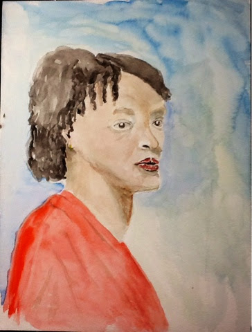

On the first painting, I'm not sure what happened with her face...I aged her about 20 years! I was working on 140 # paper with I realized it is quite forgiving, whether lifting color or just moving it around. Reworking an area is much easier.
On my second painting, I started with just a quick sketch, and then focused on the fabrics more. I worked on the face last, but realized that the head wasn't quite the right shape. I was working with a pad of 90 # paper on this one, and color saturates into the paper much quicker and any reworking that I did made the paper start falling apart.
Saturday, June 14, 2014
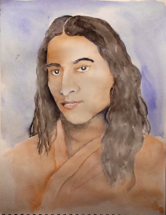
Portrait of yogananda complete
After letting this sit awhile as just blue yogananda, I decided to complete him by adding in color to give it more depth. I am still questioning whether he's done...I still could still tweak the robe a little and add some more dimension to his hair...but since I want the focus to be on his face and his eyes, I'm going to call it complete!
Wednesday, June 4, 2014
Watercolor Dragonfly
My wife loves dragonflies and now that it is spring, they are all over the place! So a couple of weeks ago, partly inspired by fellow water colorist Kandi Thompson and her piece "Dragon Fly", I decided to paint a dragonfly. I started with a pencil sketch, and added in some background color, and then it sat on my art table for about 2 weeks...I'm not sure why I was stuck. Was it the translucent wings? Deciding the colors?
I finally sat down this morning and just whipped it out. Once I had the brush in my hand, the paint just flowed out of it...literally! Looking back, maybe it needed that time to process it, but once I put my mind to it, it happened. I think I just had a bad case of procrastination.

I finally sat down this morning and just whipped it out. Once I had the brush in my hand, the paint just flowed out of it...literally! Looking back, maybe it needed that time to process it, but once I put my mind to it, it happened. I think I just had a bad case of procrastination.
Wednesday, May 21, 2014
Buddha in primary colors
 This painting had a different process than I usually do. The portrait was inspired by a quick ball point pen sketch of a water fountain that I had done several months ago in a notebook. Later, as I was going through the notebook, I thought that it might make an interesting painting, so I enlarged the sketch, originally only 2" high. The fountain was a blueish-grey color, which worked well for the ball point drawing, but I thought I would add some color to the painting. So I worked with a limited palette of red, blue, and yellow to create " Buddha in Primary Colors".
Subscribe to:
Posts (Atom)