
Showing posts with label Mike's Art Blog. Show all posts
Showing posts with label Mike's Art Blog. Show all posts
Friday, April 19, 2013
Marsh Creek
I finally broke down and bought a new paint brush. I started with my $5 set of 10 brushes from Michael's, and now I went back and bought a pointed round brush for $5. Still a far cry from the hundreds I could spend on brushes. This new brush is very versatile. I completed this painting using just the one brush, from wash to detail work
I found a nice quiet spot in between Clayton and Brentwood off Marsh Creek Road. Had to hop a couple of fences to get to down to the creek but well worth the hike. I love the rolling grassland in the area with majestic oaks scattered upon the hillsides. It was a great day with big puffy clouds and I was just far enough from the road that the only sound was the gurgling brook.

Sunday, January 27, 2013
Bridge over the American River
 Today was such a beautiful day in Sacramento, I just had to get outside. I've been cooped up inside because of rain or just being to cold to go out. (Ha, ha! I know I'm talking low 50's here. I'm just spoiled with California weather) I have just been trying to get over this creative block that prevents me from even getting started. But the good part of this is that I'm actually caught up on my blogging and I actually did this TODAY! (Not last month or a couple of weeks ago like I normally start)
  It has been a while since I was out painting along the American River, but I am drawn to this peaceful strip of land amidst the hustle and bustle of Sacramento. The Watt Avenue Bridge is one of those spots that the two converge. I particularly liked the pattern of light and dark created by the support beams, and especially the triangles of afternoon light formed by the sun peeking under the bridge.
I've been working on different techniques such as mixing the color directly on the paper and using a dry brush. I like the way the dry brush strokes on the bottom left created the appearance of the sun shimmering off the rapids in the water. I'm still working on being patient enough to let areas of the painting dry before laying down the next layer. Sometimes the resulting "bleed" creates a nice effect, like the trunk of the tree on the left. Other times its not so good (under the middle of the bridge). I also feel there are some perspective issues on the bridge...next time I will need to bring a ruler or straight edge to keep my lines and perspective straight!
Friday, January 25, 2013
Model painting January
 Back to Patris Art Studio for more figure drawing opportunities! I'm not much of a plein aire fan when its cold or the weather is unpredictable so I've been working indoors. There was quite a crowd there, so I know I'm not the only one that feels that way! Plus I can't pass up the chance to have a free model every second Saturday. I find the challenge more in the clothing than the figure. This particular time, the model is wearing a fur jacket and hat (faux fur, I hope). The sheen on the jacket is difficult to capture as well as the texture of the collar. I like the way I was able to capture the "letter" and the bench she was on through negative painting.
 |
| dry erase pen vs. vis-a-vis pen |

The second drawing was a detail of the face of the same pose (since it was a long pose). I tried the Expo pen again to continue experimenting with it. I did a little test in the bottom right corner to check how much it would bleed when wet: first with the Expo dry erase pen and then with a Vis-a-vis pen (also by Expo by the way). The dry erase held up much better to the water. The picture turned out a little "cartoony" but I like it. It is definitely a different style for me. I also felt more confident with my washes without worrying about losing detail.
I noticed the I've been stuck on profiles so I'll have to get there early next month so I'm in front and not on the side of the model again! Can you tell it's the same model from my December sketches?
 |
| That's me on the FAR left! Photo by Patris |
Sunday, January 20, 2013
Model sketching December
 I haven't done a drawing from a model for over 20 years, back when I was in college. So in the spirit of trying new things, I went to Patris Studio and Gallery (formerly Studio S12 but renamed due to moving to a new location on 26th St). The great thing is that every second Saturday of the month, they have a free model sitting from 3-6:00 pm. The host of the event is Patris, a very sweet and artistic lady, that makes you feel right at home. She has a lot of her artwork displayed in her gallery as well as work from several other artists - quite impressive works!
The model was doing one long pose, but I decided to just do some pencil drawings to start. When I went to look for my watercolors, I had forgotten them, but I had some pastels instead. So I thought they worked well as just a background color. Since the model wasn't moving, I decided I needed to move to get some different perspective. There were so many other artists at the studio taking advantage of this opportunity that the choices were limited, so I ended up all the way on the side where the model's profile had direct lighting.
I definitely had a good time at this studio. I'm going to put this on my calender for next month! Patris offers classes, other model sessions, and more...check out her blog at http://patrisstudiogallery.blogspot.com/
Tuesday, January 15, 2013
Wet on wet (on wet!)
On a cold winter Saturday morning, I went down to the American River to practice some wet-on-wet techniques. The sky was more of a dark grey, and the trees were probably not as green as the color I picked, but I was just laying some background color in to represent the far bank of the river. The near bank was just mud and grass so I started with laying down brown and some green highlights.

At this point, I've been wetting just the area of paper that I'm going to color and then laying in the color, moving it around to cover the space, tilting my pad slightly to allow gravity to help. I tried to keep a thin area of dry paper between each section to keep it all from bleeding together (had some trouble with that on the far left).
And then it started to rain! So my very wet paper started to get even more wet, but each raindrop was creating a nice effect on my painting. (I wonder if I could recreate the effect in a controled environment?) At some point though, I had to cover it for fear of complete destruction of the peice, but in the process of trying to protect it from the rain I touched the wet paper causing blemishes on the left side.
So the question that I have now: Where do I go from here? Add in details- trees, reeds -to cover the blemishes and finish the scene I started? Or, as I look at this scene now, I'm more reminded of a starry night on Lake Tahoe. Or just paint the Golden Gate Bridge and make the foreground San Francisco and the background Marin County. What do you think?
Saturday, January 12, 2013
Milk Farm

On a sunny fall day last fall, I went on a plein aire
meet-up hosted by David Peterson. The
subject of the meet-up was the Milk Farm sign in Dixon, CA. We always drive by it on the way to the Bay
Area at 70 mph, and wonder why it’s there.
There used to be a restaurant built in the 1920’s where they would have
milk chugging contests, all-the-milk-you-could-drink for 10 cents, and a record
holder wall for those who drank the most! It closed in 1986 due to damage from a wind storm and never
reopened. Residents of Dixon wanted to
save it as a historical landmark, but all that remains today is the sign in a
weed infested parking lot. Even the sign
is showing signs of dilapidation.

So after squeezing through a hole in the fence surrounding
it, I set up my chair and pulled out my sketch pad. I usually just start sketching right onto the
watercolor paper, but since I had a sketch pad with me, I decided to use
it. The interesting thing is that I
found I had more freedom knowing it was just on the sketch pad and if I messed
up, no big deal. After I finished my
sketch, I thought I would add a little color with a quick wash of blue in the
sky. Well, the sketch pad didn’t take water
very well, just pencil next time. Onto the watercolor paper…
I actually liked the outline sketch better on my sketch
pad. The one was a little stiffer. Is
that because I was a little more worried about not erasing on the water color
paper? Probably. I have noticed that too much heavy erasing affects the absorbency
of the paper.
The lettering on the sign had to be the trickiest part for
me. The first part was just to have a
steady hand. The other part was the
spacing and centering. “Milk” and “Farm” was easy enough with only 4 letters
but when I got to “Restaurant”, I actually started by putting the “au” in the
middle and worked out from there. Still
there was still extra space on the right side.
 |
| David Peterson Painting the Milk Farm Sign |
The great thing about this meet-up was that there were 3 or 4 other artists there that were very friendly and supportive. David Peterson, the host of this particular gathering, has always impressed me with his wet on wet style...very loose but somehow incorporates the details as well. He says his secret is the Expo dry erase pens: they don't bleed with water. I'll have to try that next time.
Another artist that was there was Linda Hao. She doesn't usually work in watercolor but I thought her watercolor style looked similar to mine. What do you think?
 |
| Watercolor by Linda Hao |
Sunday, January 6, 2013
Fishing at William B Pond
I went to William B Pond for the regular “1st
Sunday” meet-up of plein aire painters at 3:00 in the afternoon. There are tons
on places to find inspiration here so it turns out I didn’t see any other
artists, but sometimes that just takes the pressure off. I found a spot on the hill above the fishing
dock where a man was fishing with his young son (about 3 or 4 years old). Now fishing is all a relative term because he
was spending more time chasing after his son: keeping him from running off,
keeping him from climbing the rail, keeping him out of his tackle box. I kept thinking how he could expect a child
sit for hours watching him fish?

I figured this man deserved a spot in my painting. Other than my self portrait, this was my first attempt at putting people into a painting. OK, well I cheated a little bit by sticking him in a chair and you only see his head, but it’s a start, right?

I found the most challenging part of this was the railing on
the dock. Do I paint the rail first and paint the background over it, between
it? Or do I paint the rail in last over everything else? After experimenting a
little, I figured out that painting it last was probably the best solution in
this case. But being outside, it just wasn't drying and it got a little muddy.
By this point the dad had packed up, and the boy, barely being missed by a bike as he ran across the bike trail, was being yelled at as they headed out to the parking lot.
Thursday, January 3, 2013
Sunset at William B Pond

Back in October, my favorite time of year here in Sacramento, I went for a evening stroll with my wife down by William B Pond to catch a gorgeous sunset. An added benefit of this particular evening was there was also going to be a harvest moon, the full moon that occurs closest to the autumnal equinox. This was called a harvest moon because it never gets completely dark between sunset and moonrise allowing farmers to continue harvesting late into the night (as well as letting us hike back to our car!).
The great thing about this time of day is that you see all kinds of colors in the sky and they continually change until it is dark. These colors are all reflected in the calm waters of the pond to enhance the scene even more. The problem with painting sunsets is the same reason that they are so amazing: the colors constantly change, it doesn't last very long and soon its dark! Its hard to really get a good sense of the color even in a photograph (at least not with my camera). So, I just put down a quick horizon and then focused on the sky and the clouds. I need to work on my gradient coloring, blending the blue at the top of the sky with the reds at the horizon.


Tuesday, January 1, 2013
Locke, again!
 Locke is one of those towns that just lends its self to creativity. The buildings are so unique and the walkways throughout the town create these unusual perspectives. The last time I was here, Painting Locke, I found myself challenged by the rules of perspective, which seem even more extreme down the long narrow main street of the town. So this time, I put the vanishing point in the middle of the painting. The details of the buildings was where the challenge laid this time. I found that interpreting them into geometric shapes was the best solution. And the negative spaces between created the supporting beams (as well as a buffer to keep the colors from bleeding together).
  The left side of the street was obscured from my view, so it didn't get any attention other than the shadows that were cast. I need to work on foreshortening cars, but this was my first attempt at painting cars (putting cars into a painting!) so I thought I did pretty well. I liked the big yellow street sign at the end of the street so it got more emphasis in the painting than can be seen in the photo.
 I think my favorite part of the painting, though, is the motorcycle in the foreground. I was just experimenting with different shades of black and trying to get the essence of the bike and its shadow without too much detail.
 Thursday, December 27, 2012
Self Portrait
 Just to challenge myself, I signed up for an annual self portrait contest put on by the Plein Aire artists of Sacramento, sponsored by Martha Esch. I had not done a self portrait since college and was not sure where to start. I sat down in front of the mirror and did a quick pencil sketch. I was so pleased with how it turned out, I just left it alone. I then proceeded to copy my sketch onto watercolor paper with paint. After a few brush strokes, I realized my mistake...I had not put any sketch marks onto the paper to help with proportion and it became more of an experiment figuring out the layering of color and highlights, and not about proportion.
Definitely something I can keep practicing on. As for the competition of about 15 artists, I submitted my original sketch and I didn't place. The top three artists were all acrylic paint, so my pencil sketch paled in comparison (literally!) but I got to see some really good art and had a good time, and that is one of the goals of my art-- Have fun!
 |
| Self portrait sketch scanned with computer enhanced contrast |
Artist's Way
The Artist's Way, by Julia Cameron, is a book focused on the spiritual path to higher creativity. It helps artists discover what is blocking their creativity and connect (or reconnect) to their art, and the process, in a spiritual way. I took a 12 week class focused on this book and each of its 12 chapters from Vina Parmar of Awakening Creative Arts . At first, I wasn't sure if this was a class for me, but my wife convinced me that I should at least try it. After being in the class for 10 minutes, I knew that this was going to be a wonderful experience.

This was a piece I completed the first night of the class using colored pencils on black construction paper. I used a layering effect that I had been working on with my watercolor to create texture in the trunk of the tree. I am not sure where the idea of the eyes came from, but apparently I was thinking of a self-portrait.
.JPG) The great thing about this class was that each class exposed us to a new kind of creativity. Everything from colored pencil drawing to poetry writing, dance, vision board, and even sand art! Each week was an adventure in creativity, and learning not to be afraid of something new. It was the inspiration behind this blog!
The great thing about this class was that each class exposed us to a new kind of creativity. Everything from colored pencil drawing to poetry writing, dance, vision board, and even sand art! Each week was an adventure in creativity, and learning not to be afraid of something new. It was the inspiration behind this blog!
Check out upcoming classes in 2013!

Monday, December 24, 2012
Effie Yeaw Nature Area
 June 9 - On a beautiful Saturday morning,
I decided to go to Effie Yeaw Nature Area for a paint-out where artists were
suppose to paint and then display their works for a nominal fee on the patio of
the museum. The museum was planning a fund raiser later that afternoon. I
wasn't too sure about displaying my art, but I figured I would go and check out
what other artists were doing, take a look around, and do a little painting
myself, if I was so inspired. It had been a while since I had been to
Ancil Hoffman Park and Effie Yeaw Nature Area, so I took a stroll around. I was
amazed at how much wildlife there was: deer, turkeys, egrets.
June 9 - On a beautiful Saturday morning,
I decided to go to Effie Yeaw Nature Area for a paint-out where artists were
suppose to paint and then display their works for a nominal fee on the patio of
the museum. The museum was planning a fund raiser later that afternoon. I
wasn't too sure about displaying my art, but I figured I would go and check out
what other artists were doing, take a look around, and do a little painting
myself, if I was so inspired. It had been a while since I had been to
Ancil Hoffman Park and Effie Yeaw Nature Area, so I took a stroll around. I was
amazed at how much wildlife there was: deer, turkeys, egrets. 
Once I had walked
around the nature area, I went to find a nice quiet spot (which is pretty easy
since the whole place is quiet!) I set up alongside the path next to a large
meadow with my chair (a permanent addition to my plein aire supplies) and my
watercolors. My goal in this painting was to focus on not a lot of detail in
the background trees, while incorporating as much detail as I could in the tree
in the foreground. I reworked the trunk of the tree several times to get a
sense of the texture in the bark. After I was finished, I wished that the oak
tree was not so “cut off” but more in the painting.
An additional side note: I had seen so
much wildlife in the morning that I thought I should incorporate something into
the painting. I decided to put a small deer under the background tree on the
left. I did not like the way it was turning out so it quickly became a shadow
under the tree instead.

Here's one of the creations of another artist that was at the paint-out. I really liked the way this watercolor looks. It actually has the effects that I was working on with the background trees and foreground trees, but I like the way the bridge turned out! I took a picture of it on the easel while being displayed for the fundraiser.

Sunday, December 2, 2012
Painting Locke
On this beautiful Saturday morning I decided to make the drive down to the delta to the little town of Locke. This is a regular Plein Aire Meet-up, every 1st Saturday of the month, thanks to Martha Esch who lives in the area. The interesting thing about the Plein Aire Meet-ups is that you have no idea who is going to be there if anyone. I am guilty of RSVPing and not showing up as well as showing up without RSVPing. And so, when I got there, no one was there. It was kind of like a ghost town--well, I guess its always like a ghost town, that's part of the charm of this place. After taking a stroll around town (it takes about 15 minutes to make the loop around the whole town) I set up right on the corner of the main street through town.
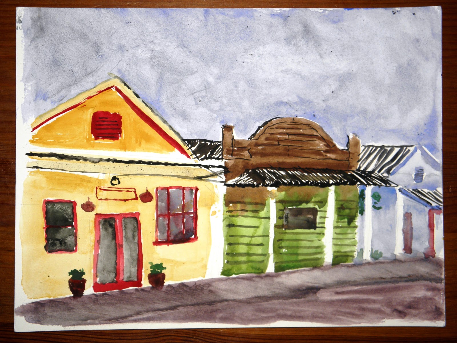
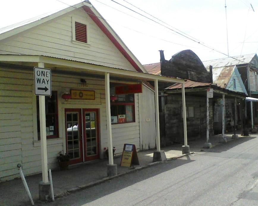 As I first started to sketch, I realized that I was going to need to remember rules of perspective from drawing classes 20 years ago- vanishing points! Landscapes have some sense of perspective but when you're drawing buildings, it becomes VERY noticeable. Even now, as I compare the painting to the photo, I can see my perspective should have been "more extreme". It just goes against reason as you are drawing diagonal lines for what your eye sees as straight lines. This was definitely a new challenge compared to the last building I had painted, the Indian Museum, where I had looked at it straight on. The eaves on the first building seemed to come straight out at me and were difficult to figure out. And although the eave supports of the second building aren't quite long enough (they appear to be against the building instead of out to the sidewalk), I really liked the effect of the negative space. I had wanted to create the same effect on the first building too but with watercolors, once your white paper is painted on, you really can't get it back! Maybe if I tried this again...? Lots of good thoughts for next time. Of course if I would work in acrylic, it would be more forgiving...hmmm, I still haven't met that challenge yet of plein aire painting with acrylic.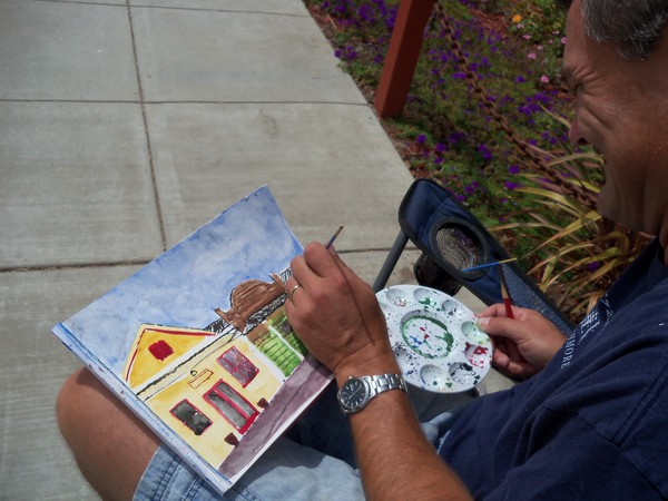
Later in the morning, Martha Esch came by and took a photo of me finishing up my painting and invited me to her studio at the end of the street, The Shack. The building itself is a piece of artwork, with very eclectic art decorating the exterior walls and patio. And once you are inside, she has on display a variety of paintings that she has done, from views of the town of Locke to old German warplanes, and Mona Lisa! She also has a small room dedicated to the history of Locke. Martha has a wealth of knowledge about this little town, historical as well as political (oh, does she have stories!). Martha also happens to be the current coordinator for the Plein Aire Meet-ups, so I thought this was a very productive outing!

Saturday, December 1, 2012
Acrylic Class
For my birthday, my wife had gifted me an acrylic painting class at Michael's. I had been commenting that I had been seeing a lot of plein aire painters using acrylic and that was never a class that I had taken in college. I think one of the things that has held me back was the cost, but as I looked into it more, the paint can be about the same cost as watercolor paint. Of course that doesn't say much because prices vary SO much depending on the brand and quality of paint. I'm still in the "cheap as you can get" stage, but the class recommended a basic starter kit including a couple of canvas boards, a brush, a palette knife, and 4 tubes of paint for around $25 (I forget if that was the price before or after the 40% off coupon at Michael's).

The class was was on a Saturday morning and focused on painting a landscape. I wasn't sure what to expect, having never been to a Michael's class or any painting class. The teacher had a specific paintings that she had created for us to copy. The students got to choose which one since some of the students had come before and had already painted some of them (returning students is a good sign she's a good teacher!). Since there were only 4-5 students in the class, the teacher was able to give each of us individual instruction and steps to work on as she walked around to the others. She walked me through each layer of the painting starting with the evergreens in the back, through the details of shadows and even the cardinal. Luckily, she shared her plethra of paint colors because it would have been quite the challenge matching her coloring with the primary colors I had!
The interesting thing about acrylic painting is the layering of colors to create depth, and if there is too much of one color then you add more of another. The white trees in the foreground don't have to be planned out because the paint will go right over it. There is no fear of "mistakes" because you just paint over it! This is much more forgiving than watercolor, but it does have a different effect than the watercolor process. I'll have to consider using this for plein aire painting, but copying someone's painting is a lot different than copying nature. And having the artist right next to me giving me pointers is always nice, too! God just isn't as good at giving pointer's when you're copying his artwork!
Monday, November 26, 2012
Indian Museum Paint-Out
My first outing with the Plein Aire Meet-up group to Sutter-Jensen Community Park was interesting but also a little intimidating. Not that a little fear is a bad thing, just part of my learning process. So I signed up for another! This time at the Indian Museum at Sutter's Fort. (and I remembered to bring a chair with me this time!) There are a lot of different scenes around the pond and several artists had already set up their easels, but I was focused on getting my own art started. That seems to be my biggest challenge: putting that first mark on the page. I'll wander around trying to find something to inspire me, start up a conversation with another artist...procrastinate! But once I get settled in and actually put paint on the page, I can get tuned in. Maybe that is why I always start with the sky...simple and non-threatening.

The building I chose was particularly challenging. The first reason being that it was a building! I had always focused on landscape, and although I liked adding in architectural features, it was never the majority of the painting. Painting a building meant that I had to use straight lines! Another challenge was the white building. The midday shadows made about 10 different shades of white. Up to this point I had never really thought about how to paint something white with watercolors. It is what you don't paint that makes it white. I started with a blue wash (as seen it the lower left) then realized I just needed to use black. A very light wash to start with and then build from there. The high sun left just a little direct sunlight just between the windows but it kind of got washed out. The lines to imply the bricks was an afterthought but I kind of like the texture it gives to the wall. I just needed it to be a little more consistant in shape.
The other challenge I had with this painting is having a light colored object (the Yucca flowers) in front of a dark object (the window frame). The brown color would overpower any other color on top of it so I had to plan the "gaps" where the stems would go while trying to keep a fluid line for the window. I did not plan for some of the lower leaves which seem to be behind the window. I still need to look into this "masking fluid" to keep areas of your painting white.
Overall, I like how my first "building painting" turned out, even with the challenges. I actually liked the straight lines! And even my oak trees in the background have improved detail from my first trees. One watercolor artist working nearby commented on how quickly I had finished, as I had started after her and finished before she was done (about an hour total), but art does not lend itself to a timeframe. The painting told me I was done.
Saturday, October 27, 2012
Introduction
.JPG) |
| Ceramic Cookie Jar -College Ceramics Class |
 |
| Bronze Horse - College Sculpture Class |
This blog is my story of getting back to my passion and my art, working though my perfectionism and fear of failure (or maybe the fear of success?), and the story that goes behind every piece of art that I create. My goal is to post a new entry several times per month, with the hope of becoming more prolific as I continue my process. Enjoy my creativity!
 |
| College Life Figure Drawing Class |
Subscribe to:
Posts (Atom)