Showing posts with label photo progression. Show all posts

Tuesday, January 19, 2016

Boba fett, photo progression

I guess I've got a Star Wars theme going here. Here is some retro Star Wars for you: Boba Fett. I started this portrait as a quick pencil sketch (not shown) with the intention of tracing it onto watercolor paper so that I could do this in watercolor. But then I just kept adding on to the original sketch which was on copy paper.  First I added in all the shading with just pencil...
Then I started to add in some color with colored pencil...not something I work with very often so I wasn't too happy with it at this point, so let's keep working it...

Smoothed out some of the colored pencil lines and added in a background but the shading originally done with pencil has lost its some of its effect...

What do you think?  I still like the one in just pencil but it is interesting how far a simple sketch can go!

Saturday, April 18, 2015

Lady in pool, watercolor

 I've always been fascinated by the way light and water react with each other. A reflection in the water is one thing, but when it is just the surface of the water bouncing the light around...that's a challenge I  had never attempted...before now. Thanks to fellow artist, Kelly Murphy, for the photo reference.
The first pic is after my first couple of washes, trying to save my whites ( I really need to invest in some masking fluid), and trying to get a gradation to represent the steps in the pool, while using the right side as an experimental area.  The next step is to add in the color of the lady, the shadow around the hat, and a few more tweaks with the water. I thought I might stop here, but then I decided to lift some of the color to create some highlights in the water. The larger areas I used a Mr. Clean sponge, but in order to lift the finer lines, I used a stiff wet brush. And lastly, to crop off the right side.
I'm ready to go for a swim. Anyone got a pool?


Sunday, January 4, 2015

Red Flowers in watercolor

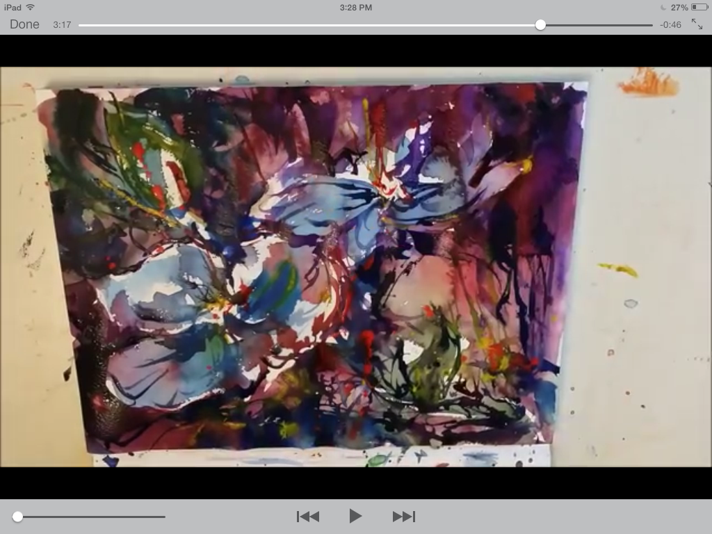
This painting was inspired by a video posted by Mikko Tyllinen on Google + demonstrating how he painted "Blue Flowers". I love how loose his painting is and how he takes advantage of watercolors' unique qualities. Here is my attempt at imitating his work although I changed the color profile from blue to red. I have put my paiting on the left and stills from the video on the right to show approximately what step I was working toward.

Quick pencil sketch 

first washes going onto the paper

working very wet, already I can see my colors aren"t as bold


Trying to put some bold colors in, A lot of bleeding colors

 At this point, I feel it is almost done ,but I'm not even halfway through the video! Mikko has a way that he keeps working the painting to get more depth but as I continue, it seems to get overworked. And I;m trying so hard to keep some of those white spaces 

Mikko states that his total paint time is 16 minutes. I took me about 30 minutes including some drying time in between. This was a great exercise in keeping my painting loose but I think I need to work on putting bolder color into my painting.

Wednesday, May 21, 2014

Forest stream...photo progression

I've been a little slow creating this month, but here is a painting that was inspired by a demonstration by Juan Pena at the Sacramento Fine Arts Center. He makes it so easy, and although a lot of his work is plein air, he did this one from memory.  I love his bold colors and the loose, flowing style that he calls "representational watercolor". Here is my attempt at imitating his style.

Saturday, April 26, 2014

Monet Bridge, a David Lobenberg workshop

I just completed a workshop with David Lobenberg with the subject being the Monet Bridge and it's reflection in the water ...perfect for me! I love the challenge of reflections. Here is a progression of the piece I worked on during this class (I also started a second one for "homework", but I'll post that one later)


This is the "completed" painting at the end of the workshop.  I have not removed the tape because there are still a few areas I'm still pondering...not sure if its finished yet. I will have to let it sit for a few days and come back to it.
The link to my second attempt of this bridge and the final version of this first one is here.

Saturday, April 19, 2014

The Longbarn cabin, a portrait of home: photo progression

Here is a photo progression of a watercolor I have been working on for my brother in law, Walter Bankovich.  This cabin has been in the Bonelli family, his grandmother, for a long time and I thought I would honor the house with a portrait.

I had just taken a workshop from David Lobenberg and was amazed to realize that it was ok to trace! I guess I just needed permission from another artist. It's is one of those preconceived beliefs that I had that it's "cheating" if I trace.  Other than the project from that workshop  (which I am still working on), this was the first time I had enlarged a photo and traced right onto the watercolor paper with the extremely fancy technique of taping it to the window! Once I had the structure of the house and the main areas of light and dark,  I laid down a light wash to create some depth and leaving highlight areas. Then it was just a matter of going back and putting in more and more detail, including the house placard "the Bonelli's" and street number done in pen ( they don't show up very well in the photo).


Tuesday, March 25, 2014

Flame in the woods - photo progression

A friend of mine had asked me to do some illustrations for a book he's writing. As I read through his draft, this scene came to mind. It's similar to a painting I had seen by Gordon MacKenzie titled "Under the Stars". I should have used masking fluid on this piece to help build contrast on the trees, but I decided to try painting around the negative spaces of the trees. Creating a gradient from light to dark AND avoiding painting the trees is a challenge. I probably built more layers of color on the piece than any other piece, and the 90 lb. paper I used took a beating! I need to start working on heavier weight paper! Enjoy the first draft of "Flame in the Woods".


Tuesday, February 25, 2014

Watercolor of an elephant, photo progression

I had a lot of people like my pencil sketch of an elephant that I decided I should try it in watercolor. Here is a progression of the steps. First, I took the image of the pencil sketched elephant, enlarged it a little, and traced it out with pencil.
Once I had the outline, I put down a background wash.
Then I put in the shadows with blue, mixing in some black for the deep shadows.
I added in some burnt sienna to warm the painting.
Then I added in the details with some black, including eyes, wrinkles, and a few more shadows.  Once I added the shadow on the ground, the elephant became much more "grounded". The last touch was adding in the grass in the foreground and a hint of greenery behind. 
I also improved the lighting that I was using to photograph it. That makes a huge difference, taking it from that yellow to actual white!