
Wednesday, December 24, 2014
Hand painted coasters
I feel homemade gifts are always the best. They carry a certain charm and, in my opinion, are better than the gift cards that people always resort to. Here is a great last-minute gift idea...monogrammed coasters! These "coasters" were purchased at a local hardware store in the tile department. Then with black acrylic paint, I monogrammed each tile. I always have trouble making lettering look exactly the same, so I did a little font research and created "B" in four different ways! I'm not sure if I need to put a clear coat on top to extend the life of the paint...I like the matte, rustic look so I skipped it.
Friday, December 19, 2014
Painting coquito bottles
Every year around Christmas, we make a batch or two of coquito, a Puerto Rican version of spiked egg nog. The Puerto Rican tradition is to gift hand-painted bottles full of coquito, then the following year they return the empty painted bottle for a refill. I painted a bunch back in 2012, but never got all of them filled. My wife was too attached to a few of them and didn't want to give them away!


Painting on a glass bottle is an interesting challenge. We invited some friends over this year to paint their own bottles. The problem is that we kept drinking the coquito! The skull is the one I created this year for my daughter...not necessarily for coquito. The other ones are bottles I painted two years ago.
 |
| This year's bottle painting |


Saturday, December 13, 2014
Christmas cards (or Holiday cards!)
I got together with my Artist Way group to make Christmas cards. They really go all out with materials and supplies, because they love to experiment with different processes and multimedia. I'm more of a purist myself but it's good to get out of my comfort zone once in a while. Here are some Christmas cards that I created. I actually started with a sheet of watercolor paper that someone else had started with a blue and green wash. She said it didn't turn out like she wanted, but I thought it would be perfect for a background (and I hated for it to go to waste). Then I added more paint and stamped them. The first two are my favorite...


For this last set of cards I really went out of my comfort zone with stamps and glitter! (It doesn't show up well in my photos though)

Although I call them Christmas cards, only this second to last one says Christmas, so I suppose "holiday cards" is a more appropriate title...good for EVERY occasion!
Friday, November 28, 2014
Autumn leaves, watercolor
This is my favorite time of year, and with the beautiful weather here in California, I have been enjoying going for walks along the American River. The fall leaves have slowly been turning colors, and it just amazes me how the colors just blend into each other on every leaf, each one a little piece of art!
I decided to try my hand at blending the leaf colors together. I worked with wet-on-wet to bleed the colors together, with lots of little accidents along the way...some good and some bad.
And here are the results...

I decided to try my hand at blending the leaf colors together. I worked with wet-on-wet to bleed the colors together, with lots of little accidents along the way...some good and some bad.
And here are the results...
Tuesday, November 25, 2014
Abandoned art, watercolor squares
So here are the pieces that I had created to be abandoned. I'm kind of attached to them now and I don't think they deserve to be abandoned any more. All of these are done on 4x4" squares of watercolor paper. Great for Christmas gifts or maybe I should mount them into a grid in a collage frame to display them as one piece.
Just some thoughts about the art...
For some reason I was stuck on creating negative spaces...for the lettering, the flowers, the eye.
I love the eye, but realize the challenge in portraits is not in creating one eye, but in creating a second mirror image that matches! The "imagine" piece is a bit chaotic, but I suppose the universe as well as my imagination might seem like that.


Friday, November 21, 2014
Lotus Pond, watercolor
I offered to donate an original watercolor for the Spiritual Life Center silent auction. I decided to create something new, instead of looking through my old paintings. The idea of the lotus pond actually came from a picture on their website, slcworld.org.
I think the lotus flowers turned out very well. The shape and size of the "lily pads" seem to throw the perspective off a little, but I like the textures that I was able to create on them.
What are your thoughts on this painting?
I think the lotus flowers turned out very well. The shape and size of the "lily pads" seem to throw the perspective off a little, but I like the textures that I was able to create on them.
What are your thoughts on this painting?


Framed and ready for auction.
Sunday, November 16, 2014
Ball point pen sketch - The Men's Group
Quick half hour sketch of the men's group drinking coffee while listening to a speaker. I was using what I had available: lined notebook paper and a very bad ball point pen. Since I missed my usual 2nd Saturday portrait practice, this was the next best thing. It looks like a rather somber group but we really do have fun!

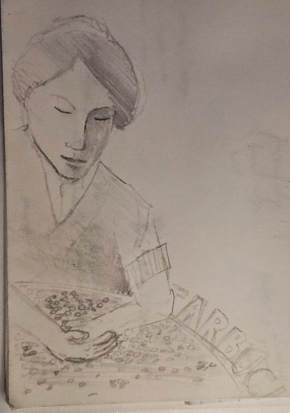
Pencil portrait practice
Here's a couple of pencil drawings that were in my notebook that I had done this past year. My focus was on simplifying facial features. The first one was copied from a picture on the wall in a Starbucks...I need more practice simplifying the hand.
This second one was from a picture online with stark lighting.
Tuesday, November 11, 2014
Kiva beach, plein aire
There are so many opportunities to paint plein air at Lake Tahoe, sometimes I get overwhelmed. I just want to soak it in mentally, take pictures, and say I'll do it later at home. That defeats the purpose of plein air though. So on a beautiful fall afternoon, I finally decided on a spot out on the Camp Richardson pier...the beach was all shady and cold. The sun seemed to be going down really quick and the shadows were changing even quicker. I did the majority of this piece in an hour. When I was finished, I was looking straight into the sun.
My goal was to make it look like the foreground trees were all in shadow with the light filtering through. I tweaked the details a little more once I was home. I think I could have gone even darker for the shadows, but I always worry it will go too dark and lose the color.
My goal was to make it look like the foreground trees were all in shadow with the light filtering through. I tweaked the details a little more once I was home. I think I could have gone even darker for the shadows, but I always worry it will go too dark and lose the color.
The fun part of this was that every 10 minutes or so, people would be walking down the pier, stop and watch for a few minutes, make a few comments to each other about my painting and then keep walking. At first it was a little intimidating but then I got over myself and enjoyed the commentary.


Haunted house, plein aire watercolor

My perspective lines are still off a little bit...seems to be an area I need to work on if I keep painting houses. I used a couple of new techniques as well. I used a crayon on the street sign to write the numbers and letters so it would resist the watercolor. I also had to lift color off a couple of areas, which I did with a stiff damp brush. Luckily I was using heavier paper so that this worked. Otherwise the paper would have just started falling apart. I used white paint several times as well with varying success. The cob webs on the bushes just didn't show up like I wanted them to. Next time, I would darken the bushes and try scraping the webs in with a knife.
At one point I thought I was done, but then realized there were a couple more details that I could add, but eventually I just have to say, "I'm done!" Can you find the four changes I made to the second pic?


 Check out more of her work on Instagram: @autumnelizamakeup
The 4 differences are: I added cobwebs on the bushes (which don't show very well), there's another pumpkin on the right side of the porch, the bat above the new pumpkin, and I moved the base of the street sign :)
Saturday, November 8, 2014
Experimenting with watercolors
I taught a class about water coloring to my Artist Way group, focusing on different effects that can be created with watercolor. We started by talking about the different consistencies of the paint, depending on the water-paint ratio: tea, milk, or cream. Start with tea, and work your way up to cream. We discussed the nature of water always going to where it is dry...going from wet brush to dry paper, or wet paper to dry brush. I showed how to do washes and wet on wet blending of color, as well as resist with crayon, blotting, and even trying a salt effect. Sometimes I think I know just enough to be dangerous! It was just a fun night of playing with watercolor. Here are a couple of pieces I created...there was no plan, both of these just developed into something from trial and error.


Friday, October 31, 2014
Portrait of a zombie
Being inspired by my daughter's special effects make-up, Autumn Eliza SFX, I decided to do a portrait of one of her "zombies". This particular zombie is one she designed for a Halloween costume segment on Good Day Sacramento.
The coloring on the skin was pretty simple since there is no wrong color, but I just used up previous washes of blue and green from my landscape palette to get a creepy pale color.
Happy Halloween!

The coloring on the skin was pretty simple since there is no wrong color, but I just used up previous washes of blue and green from my landscape palette to get a creepy pale color.
Happy Halloween!

Saturday, October 25, 2014
Pencil sketch - coastal fog
Here is a pencil sketch inspired by a watercolor demo by Howard Luke Lucas...the fog coming in on a coastal canyon. Interpreting his watercolor with pencil was an interesting experiment. As he is putting down washes, I'm quickly trying to cross hatch or smudge the same areas in pencil. My drawing is a mirror image since we saw the demo through an overhead mirror. I will try to recreate this later in watercolor too.

Saturday, September 13, 2014
Experimenting with pan pastels
It has been a while since I have posted a blog, but life gets busy! Being inspired to try something new by my Artist's Way group, I experimented with a new medium, pan pastels...basically pastel powder packed into a container. It is applied with sponge applicators, and I also used makeup wedges. It is challenging to get any sharp lines, but it works great for blending. I was using some scrap paper, so it wasn't a very heavy weight.
 I started with a basic landscape, adding layers of color, but I should have combined it with some pastel sticks to incorporate some detail. Even with the smaller sponge applicators, I just couldn't get a sharp line.
 This piece actually started as my "sponge cleaning" paper, just to get some of the extra pastel off the sponge, but then I started creating something out of it, using a big pink eraser, which picked up the pastel quite well.

Overall it was fun to play with these pan pastels, and I could see using them in a mixed media application.
Friday, August 15, 2014
Tree on the edge of a field
Another beautiful day for outdoor painting in Georgia. I took advantage of some quiet time while 2 of the grandkids are at school and the other one is napping.
I got so caught up in creating the background, and then most of it ends up covered by the tree in the foreground. I might go and paint just the field tomorrow.
I liked the detail of the gourd birdhouse hanging from the tree. It was actually hanging on the other side of the tree, but when I moved it to the left, I put the shadow on the wrong side of the gourd!
Tuesday, August 12, 2014
Plein air watercolor barn in Georgia
Another day plein air painting in Georgia. The barn was just begging to be painted. The clouds were kind or threatening to storm, as they have been every afternoon this week, so I got to finish most of the painting outside, but then had to finish it up inside.
I debated whether to but the lines on the barn to show the wood planking. The barn looked a little flat without it, but a little busy with them...


Wednesday, August 6, 2014
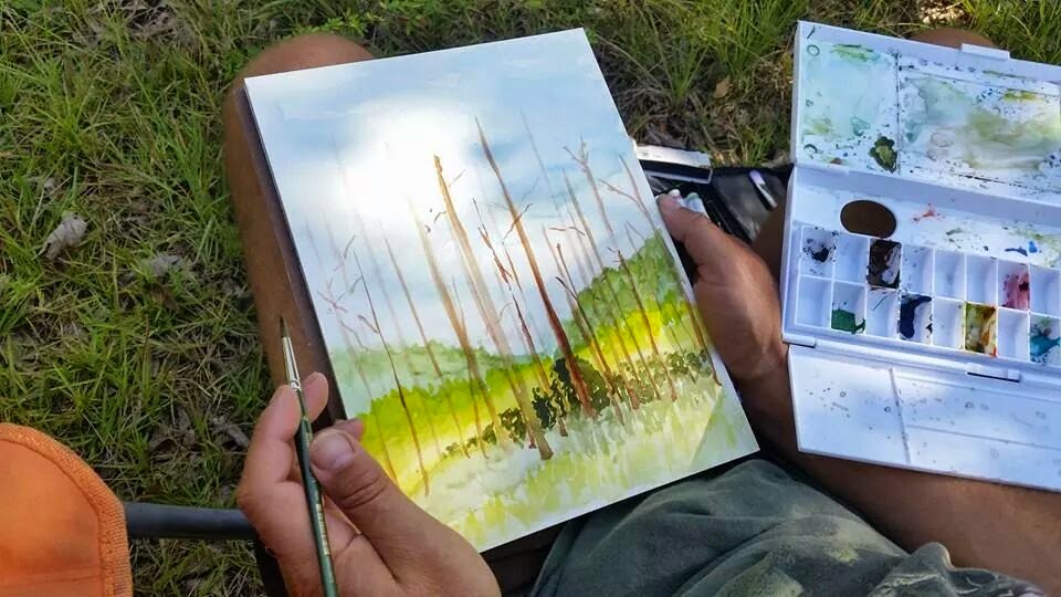
Stand of pine trees, Plein air watercolor
While on vacation to visit the grand kids in Georgia, it's challenging to find time to paint. Sneaking off to the edge of the property, I found a stand of pine trees to paint. It only lasted a short while before my 4 year old granddaughter found me and wanted to paint, too. With a little help, I got her set up with some paint brushes and paper to paint with me. She had to share my palette though, so that made things a little tougher. This piece still needs a little more detail work, but I figure I can do that later when I have more time and less distractions.


Saturday, July 12, 2014
Portrait practice at Patris' Studio
It seems like it's been awhile since I went to Patris' studio for the 2nd Saturday long pose. Drawing people really takes continuous practice. My first piece of just the head went pretty quick so I decided to do a quick full body piece as well.
On the first painting, I'm not sure what happened with her face...I aged her about 20 years! I was working on 140 # paper with I realized it is quite forgiving, whether lifting color or just moving it around. Reworking an area is much easier.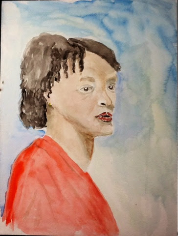

On the first painting, I'm not sure what happened with her face...I aged her about 20 years! I was working on 140 # paper with I realized it is quite forgiving, whether lifting color or just moving it around. Reworking an area is much easier.
On my second painting, I started with just a quick sketch, and then focused on the fabrics more. I worked on the face last, but realized that the head wasn't quite the right shape. I was working with a pad of 90 # paper on this one, and color saturates into the paper much quicker and any reworking that I did made the paper start falling apart.
Thursday, June 26, 2014
Mt. Tallac in watercolor, Plein air
An iconic feature of South Lake Tahoe, Mt. Tallac can be seen from most anywhere in town. It is quickly recognized by the snow in the shape of a cross. This snow used to be there year round but recently has started to melt more in the summer...global warming? In my painting, I was generous with the snow in the cross.
In the late afternoon, my family went down to the lake, specifically the west end of Kiva Beach, and while they played on the beach, I painted. The afternoon sun tends to shade a lot of the peak, so the colors are a little darker than they would have been in the morning.
I started out with a quick pencil sketch as I usually do, then added in the sky and clouds (since they move so quickly!) and continued working down adding in the foreground trees last. When I was finished, I kind of wished I had made the piece vertical so that I could have included Taylor Creek in the foreground.
 Reference photo...before the clouds floated away
 Pencil sketch
 Finished painting drying on easel
 Next time...vertical format including Taylor Creek. (Clouds are already gone...)

I started out with a quick pencil sketch as I usually do, then added in the sky and clouds (since they move so quickly!) and continued working down adding in the foreground trees last. When I was finished, I kind of wished I had made the piece vertical so that I could have included Taylor Creek in the foreground.
Finished painting
Subscribe to:
Posts (Atom)