
Sunday, December 29, 2013
Meditating Buddha watercolor
Another Christmas gift...for my wife to put into her meditation room. This was started about 8 months ago with a sketch of Buddha. Next, I drew a pencil outline of the buddha and painted just the background in a wet-on-wet style.Then it sat for about 6 months. One of the reasons I've been practicing portraits is so I could feel confident in finishing this piece. The hands are still the part that trips me up, and these where in a particularly challenging position. This is one of those paintings that I could continue tweeking, but at some point I had to say I was finished.
Animal watercolor: portrait of a cat
 I created this painting of our pet cat for a Christmas gift for my daughter. I think the most challenging part of the process was getting our cat to sit still long enough to get a photo of her! Once I had the photo, I worked directly from the photo to create the painting. To create the texture of the fur I added some white back in. I love the eye color that I got. It really captures her actual eye color. I am always challenged with mixing accurate colors. Working with landscapes, nature colors are much more forgiving, while portrait colors are not. The rest of the cat's coloring was easy since it is just black and white!
This will probably be the first of many animal paintings....

Monday, December 16, 2013
Portrait of a guitar player in watercolor
 It seems like it's been forever since I have posted anything...over a month! Where did November go? Anyways, I'm back to creating, and what better way than at Patris Studio and Art Gallery with a free 2nd Saturday long pose. I am developing more confidence with portraits as I continue practicing. The challenge that I have is developing the right skin tone (as you can see from my test patches at the bottom) and then not having it look flat. One of the other artists there gave me some pointers and suggested adjusting skin tone for different areas of the face... adding a little yellow to lighten the skin tone and green to darken the skin tone. Sounded odd but I think it turned out well. And I was pleased with the hand too! (Something else that I needed to practice.) The whole eye-liner thing seems to have worked too!
Sunday, October 27, 2013
Skull Art for Day of the Dead
 |
| plain sugar skull, front and back |
 |
| My daughter's sugar skull |
 |
| My sugar skull |


 |
| My other daughter face painting |

As long as I was in skull theme, I figured I would practice some pencil drawing as well. It is challenging to smudge purposefully and not smudge in places not intended as in some of my other pencil sketches. I tend to smudge the bottom left side due to my left-handedness.
Watercolor of a starry night
 Now that we are finally getting some fall weather here in Sacramento, I was reminiscing about a painting that I thought of doing while camping this summer. One of those scenes that I only wish I could capture with a camera: a starry night under the trees!
And then after attending the Rancho Cordova City Hall art show themed "UP", I could not resist putting this idea onto paper! The perspective definitely makes you think of looking "up".
I have been wanting to try mixing salt with watercolors for a while and I thought it might create a "starry" sky. Not quite as dark and contrasting as I had hoped for, but definitely interesting texture. Once I was all done, it reminded me of one of the paintings from the Subaru commercial with the plein air painter! Ha ha!

Friday, October 25, 2013
Sailboat on Lake Natoma
 What better way to spend a Saturday morning than sitting out by the smooth glassy water of Lake Natoma painting? We'll let me tell you: sleeping in and then enjoying a nice cup of coffee with my wife! So I got to the aquatic center on Lake Natoma around 10:30, just in time to see about 30 kids heading down to the dock. The water was smooth, but not for long. I decided to toss out the idea of plein air painting and take a picture before the kid started rowing. Then I went home and painted in my studio from the picture.
Monday, October 14, 2013
Watercolor painting and sketching from a model
 It's been a couple of weeks since I have painted and it's always easier to get inspired (or peer pressured) if there is a group of artists working, so I went to Patris' Studio to paint from a model. The last time I was there, practicing portraits, I felt the painting was a little flat or dull, so I decided to liven this portrait up by focusing just on the face and incorporating some brighter colors.
Then I moved to the other side of the room and did a full body sketch with pencil. I'm old-fashion and just use a #2 pencil. I also have a tendency to make smudge-marks. I still need to work on hands, one of those things that always seem to look a little awkward. If I had more time, I might have created this in watercolor. I will put it on my "art" to-do list...
.JPG)
Potential, the oak within the acorn, revisited and renamed
 |
| before... |
 |
| Completed and framed - Potential |
Sunday, September 22, 2013
Watercolor of wine grapes
 A friend of mine had a birthday coming up and one of the things he loves is vineyards, grapes, anything to do with wine. And it's that time of year...Crush! I had seen a painting at an art studio a while back that inspired me to create something similar. With the help of Google Images, I had an image as a starting point and went from there.
 Since this was going to be a framed piece, I actually worked backwards so it would fit in an existing 11x14 frame I had with a 1/4 inch border since it did not have a mat. With a little measuring and remeasuring (Why do they make 11x14 sized pads of paper 11x15?) I got the painters tape laid out for the correct size painting. I usually work outside but since I was inside, I had to pull out the blow dryer several times just to get the paint to dry so I could move on...waiting for paint to dry if not one of my strengths!
Here is the finished piece, framed and ready to go!

Sunday, September 15, 2013
Practicing Portrait Painting at Patris Studio
 It's been a long time since I've done a portrait with watercolor. Patris Art Studio offers a model to draw each 2nd Saturday and I hadn't been there since i did model painting in January. The most challenging part of this was finding a good flesh tone. I started with her left arm, but it was way too jaundice looking. So I adjusted it and tried the other arm which was much closer to her coloring. Of course after mixing yellow, red, and a couple other washes I had on my palette, I don't know if I could recreate it.
The 3/4 face view is the most challenging for me so I made sure that I set up my easel in the perfect spot. It turned out pretty good, but it is very stiff. I definitly will need to keep working on loosening up.
Thursday, August 29, 2013
Study of a Sunflower
Playing with other mediums other than watercolors keeps me on my toes. I started with a colored pencil sketch of a sunflower from imagination.
 Then I tried translating that into acrylic on canvas. Acrylic is definitely my weakest medium here. Some people love it because it is a forgiving medium, but I still don't have a strong grasp of it.

Tuesday, August 27, 2013
More California Auto Museum sketches
Here are the other sketches from the California Auto Museum Plein air Painting Meet-up. 
This top one is a quick pencil sketch of the car that you see when you first walk in.
The second one is my "entrance fee", a 10 minute sketch on a note card (it was more like 25 minutes) that I donated to the museum.
Here is a compilation of the other artists' note cards. I am not sure whose is who's, except for the bottom one. Martha Esch was working on the same 1935 Cadillac as I was sketching.
Saturday, August 24, 2013
Watercolor Painting of Model T Ford at the California Auto Museum
Painting cars has never been something that I have done much of since my goal is to be out in nature as much as possible, but I was invited to a Plein Air meet-up at the California Auto Museum and decided it would be a good challenge. Martha Esch, the host of the event, had arranged for our "payment" into the museum to be a quick sketch on a note card to be donated to the museum. What an awesome idea! Of course my quick sketch ended up taking me almost 30 minutes.
 It was quite an honor being able to go inside the museum to paint, as long as we didn't spill or clean our brushes like Bob Ross ( ha ha!) There are so many great cars there from a Delorean to a Dodge Pacer. The cars are placed close together though so it was hard to get a good spot to paint. I found a Model T that was in a nice quiet corner. The museum lighting was the hardest part to work with. The model T had a flat finish so reflection was minimal. But then determining how much detail to add or omit was challenging as well. Overall I think it turned out well.
Check out more sketches from this trip to the California Auto Museum here.
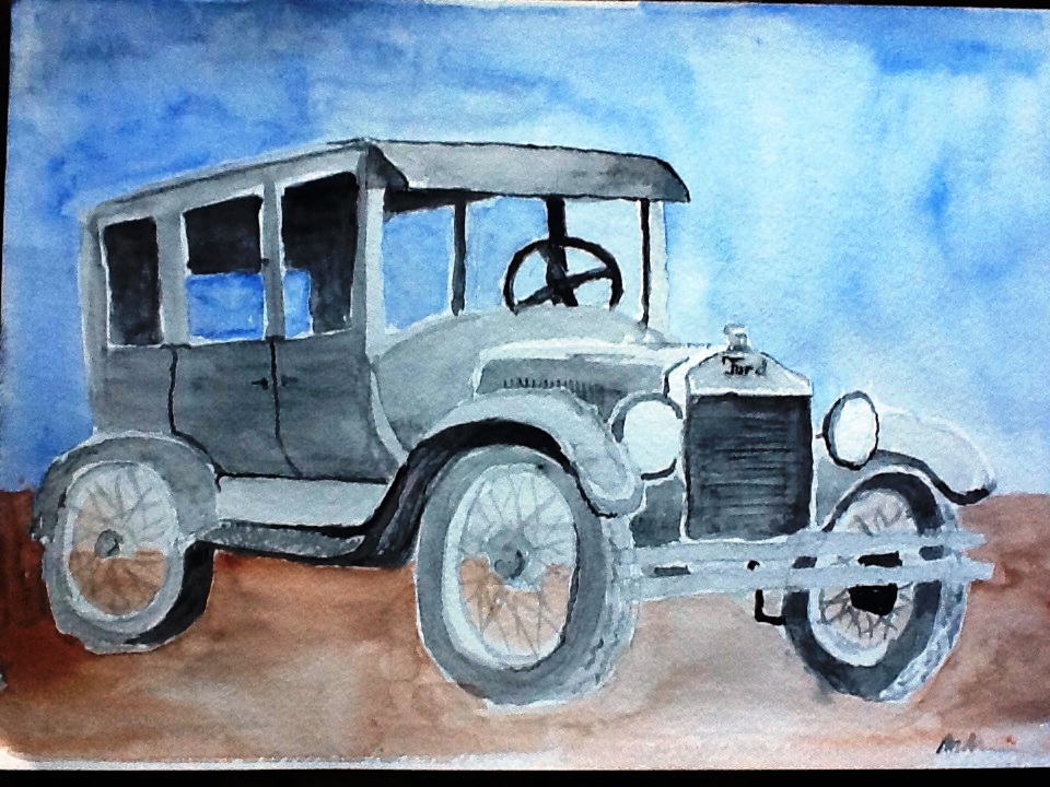
It was quite an honor being able to go inside the museum to paint, as long as we didn't spill or clean our brushes like Bob Ross ( ha ha!) There are so many great cars there from a Delorean to a Dodge Pacer. The cars are placed close together though so it was hard to get a good spot to paint. I found a Model T that was in a nice quiet corner. The museum lighting was the hardest part to work with. The model T had a flat finish so reflection was minimal. But then determining how much detail to add or omit was challenging as well. Overall I think it turned out well.Check out more sketches from this trip to the California Auto Museum here.
Monday, August 19, 2013
Plein air painting at Pinecrest Lake
Can't beat being at the beach, in the mountains, and painting simultaneously! Pinecrest Lake never fails to disappoint...

I love painting the water but I'm still trying to figure out how to best represent the ripples on the water...
Friday, August 2, 2013
Fun with sidewalk chalk
After working as a camp counselor for Camp Celiac for a second week, I just needed to get some creativity out. The "Chalk Garden" was just the place! The impermanence of it is freeing. So with a bucket full of random sidewalk chalk colors, I started playing around. And the great thing is that it was contagious...soon the campers were creating too!


Pencil drawing at camp
While being a camp counselor at Camp Celiac for a couple weeks, it was nice to be able to sneak away for a while to be creative. Not knowing how much time I was going to have, I stuck with pencil, which always makes for quick set up and clean up. Landscape drawing with pencil is always challenging because I have to get creative determining what shade to give to different colors. I sketched this plein-air and then later, snapped a photo of the scene with my phone. I think it turned out quite accurate to the scene...not as much artistic licence as I have taken in the past! I need to work on not smearing as I drag my hand across my work.


Sunday, July 21, 2013
Plein air painting at the pond fountain at Land Park
So I finally get outside to do some plain air painting with our Plein Air Meetup group, and its 106 degrees out! I wonder why only a couple of us showed up? It actually didn't feel too bad in the shade next to the water. I was working with some new paints today that are much better quality than the $5 set of twelve tubes I was working with before. The tricky part is that there are only 5 colors...it just lends for more practice color-blending. They are made with a honey base so they have more brilliant color and don't dry as fast on the palette ( that was particularly important on a hot day like today).
I'm still trying to figure out the reflection and ripple effect that is created by water, so I keep challenging myself with it. My last attempt was at Hagan Park and today I'm at Land Park. I started at the top with the sky and worked my way down with the trees and grass, and finishing with the pond. I "cheated" a little bit because I used white paint to create the water spray (most watercolorists would say to use the white of the paper instead but without masking fluid, it just wasn't going to work). Although there were a couple other people painting, I was so totally focused, I probably wasn't very good company.

I'm still trying to figure out the reflection and ripple effect that is created by water, so I keep challenging myself with it. My last attempt was at Hagan Park and today I'm at Land Park. I started at the top with the sky and worked my way down with the trees and grass, and finishing with the pond. I "cheated" a little bit because I used white paint to create the water spray (most watercolorists would say to use the white of the paper instead but without masking fluid, it just wasn't going to work). Although there were a couple other people painting, I was so totally focused, I probably wasn't very good company.
Monday, July 15, 2013
Watercolor of the sea and sky


Original Watercolor by Alisa Laporte
Size 9 1/2 in by 3 7/8 in
Starry night
We were at a friend's house trying to figure out a Sip & Paint class...Drink & Draw? Painting & Partaking? Anyways, we were deciding on a painting to create with non- artist type people that were there just to have fun and we decided on Van Gogh's Starry Night. Although it looks simple enough, and was very fun to paint for me, it is very complex. The impasto brush strokes, those small and short ones throughout the painting are very difficult too duplicate. And then to complicate things even more, I was working with acrylic paint, which I rarely do...but the wine helped :) My favorite part was actually the little town.
My preliminary watercolor sketch:


And the one my friend Rhonda did (still not quite complete):

Here is Van Gogh's original Starry Night:

My preliminary watercolor sketch:
And my acrylic rendition:

And the one my friend Rhonda did (still not quite complete):
Chinese style painting


So I used only black watercolor, instead of ink, to create the waterfall scene. As I painted, the scene developed into something quite different that the original picture. The original picture had more than just black ...but I decided to keep to just the monochromatic theme. I couldn't figure out how to put blossoms on the tree so it just looks like a dead tree. The placement of the tree seemed so effortless in the original picture, but in mine it seems a little awkward. I added a mountain and a second waterfall to fill in the background. And then trying to capture the movement of the water was a challenge, but overall I think it turned out well, but definitely with my own flare!
Friday, May 31, 2013
A bridge at Hagan Park

I really worked on leaving negative spaces on this piece...no masking fluid used (I still have to get some of that so I can figure it out). The bridge kind of reminds me of Monet's Bridge Over a Pond of Water Lilies.

Plein air painting at the pond in Hagan Park, Rancho Cordova
 I was out at Hagan Park this week, looking for some insiration to paint, with my new stool and easle that I had gotten for my birthday. Whenever I am here I always think about the large pond but never made the time to sit down and paint it, until now! The pond is always smooth and reflective, so I challenged myself with treating the reflction a little different than I usually do when I am out painting the river. I quite like the texture that it created in the painting! The idea of painting vertically instead of having the painting pad on my lap was tricky to get use to. It is suppose to help the paint flow better, but I guess it takes some getting use to.
 It's kind of intimidating looking at the photograph right next to my painting, but I think I did a pretty good representation of the scene.
Subscribe to:
Posts (Atom)