An artist's journey of self-discovery, passion, and creativity
Showing posts with label Plein Aire Painting. Show all posts
Wednesday, February 18, 2015
Gristmill plein air watercolor
Tuesday, November 11, 2014
Kiva beach, plein aire
There are so many opportunities to paint plein air at Lake Tahoe, sometimes I get overwhelmed. I just want to soak it in mentally, take pictures, and say I'll do it later at home. That defeats the purpose of plein air though. So on a beautiful fall afternoon, I finally decided on a spot out on the Camp Richardson pier...the beach was all shady and cold. The sun seemed to be going down really quick and the shadows were changing even quicker. I did the majority of this piece in an hour. When I was finished, I was looking straight into the sun.
My goal was to make it look like the foreground trees were all in shadow with the light filtering through. I tweaked the details a little more once I was home. I think I could have gone even darker for the shadows, but I always worry it will go too dark and lose the color.
Haunted house, plein aire watercolor
A friend had invited me to an "Artober" festival where they invited several plein aire painters, face painters, etc. It was centered around a house that was decorated to the hilt with Halloween decor. Although the task of simplifying it down to paint was daunting, I took the challenge! A majority of the piece was done plein air, but I have to admit, I took a photo so I could finish it at home.
My perspective lines are still off a little bit...seems to be an area I need to work on if I keep painting houses. I used a couple of new techniques as well. I used a crayon on the street sign to write the numbers and letters so it would resist the watercolor. I also had to lift color off a couple of areas, which I did with a stiff damp brush. Luckily I was using heavier paper so that this worked. Otherwise the paper would have just started falling apart. I used white paint several times as well with varying success. The cob webs on the bushes just didn't show up like I wanted them to. Next time, I would darken the bushes and try scraping the webs in with a knife.
At one point I thought I was done, but then realized there were a couple more details that I could add, but eventually I just have to say, "I'm done!" Can you find the four changes I made to the second pic?
On another note, my daughter decided to come with me to try out her artistic side...special effects makeup. Here are some pics of her creations.
The 4 differences are: I added cobwebs on the bushes (which don't show very well), there's another pumpkin on the right side of the porch, the bat above the new pumpkin, and I moved the base of the street sign :)
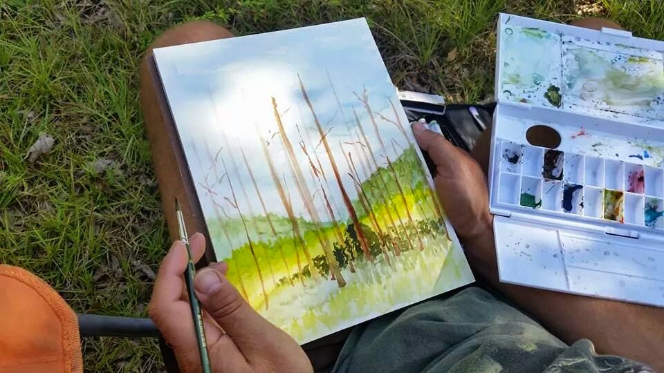
Friday, August 15, 2014
Tree on the edge of a field
Another beautiful day for outdoor painting in Georgia. I took advantage of some quiet time while 2 of the grandkids are at school and the other one is napping.
I got so caught up in creating the background, and then most of it ends up covered by the tree in the foreground. I might go and paint just the field tomorrow.
I liked the detail of the gourd birdhouse hanging from the tree. It was actually hanging on the other side of the tree, but when I moved it to the left, I put the shadow on the wrong side of the gourd!
Wednesday, August 6, 2014
Stand of pine trees, Plein air watercolor
While on vacation to visit the grand kids in Georgia, it's challenging to find time to paint. Sneaking off to the edge of the property, I found a stand of pine trees to paint. It only lasted a short while before my 4 year old granddaughter found me and wanted to paint, too. With a little help, I got her set up with some paint brushes and paper to paint with me. She had to share my palette though, so that made things a little tougher. This piece still needs a little more detail work, but I figure I can do that later when I have more time and less distractions.
Thursday, June 19, 2014
Plein air at Zephyr Cove
Post 100 on my blog! Continuing my Tahoe vacation, I spent the day at Zephyr Cove hanging out at the beach getting thoroughly sunburned. This has always been one of my favorite spots on the lake because of the rock formations that jut out into the lake.
After completing the painting, I checked my reference photos and realized that my values were off...the sky was a lighter blue, the mountains were darker than the sky, but lighter than the distant lake. I will need to rework this one later, but I think I just need to add more color to the water to finish this one for now.
Saturday, April 19, 2014
Plein air painting vernal pools
I ended up doing two paintings of the same pool but from slightly different perspectives. I tried using a little different style for each on, but they turned out very similar. Which one do you like better?
Monday, April 7, 2014
Plein air painting small rapids
I am taking advantage of this wonderfully warm spring weather...although the down side is that we need more rain. The river is particularly low right now. I am fascinated with the movement of the water, and the effects it has on the reflections on the water, bouncing light and colors in different ways. So here is my attempt to capture this small section of rapids as it flows over the rocks.
Monday, March 24, 2014
Plein air watercolor, shadows and reflections
Sunday, March 9, 2014
Plein air painting on the American River
This boat was not there while I was painting but after I was finished, it showed up. Maybe I should paint it in...what do you think?
Saturday, February 22, 2014
Watercolor Clouds
So I decided to take on a challenge that has always eluded me...clouds. I love watching clouds moving through the sky, whether it's high wispy cirrus clouds or big cotton ball like cumulus clouds...I could watch them all day, but when it comes to painting them...that's when I struggle.
My inspiration for this piece was a watercolor piece by Charles Cherry titled "Distant Hills and Clouds".
When I started to paint this, I thought I would go outside to be inspired, but there wasn't a cloud in the sky. I also noticed that I had no palette to mix colors on. I haven't worked plein air in quite a while so some of my supplies we're sitting on my table at home. I ended up pulling the color right from the tube. I hate doing it for fear I'll contaminate the whole tube, but as you can see, I only used 3 colors total and only mixed colors a little on the paper.
Looking at the finished piece, I needed to use a darker color in the clouds for the shadows. I also need to loosen up my "cloud shape". It looks too uniform and too scalloped. It does not come across as realistic. Any pointers would be appreciated.
Tuesday, August 27, 2013
More California Auto Museum sketches
Here are the other sketches from the California Auto Museum Plein air Painting Meet-up. 
The second one is my "entrance fee", a 10 minute sketch on a note card (it was more like 25 minutes) that I donated to the museum.Here is a compilation of the other artists' note cards. I am not sure whose is who's, except for the bottom one. Martha Esch was working on the same 1935 Cadillac as I was sketching.
Monday, August 19, 2013
Plein air painting at Pinecrest Lake
Can't beat being at the beach, in the mountains, and painting simultaneously! Pinecrest Lake never fails to disappoint...
I love painting the water but I'm still trying to figure out how to best represent the ripples on the water...
Sunday, July 21, 2013
Plein air painting at the pond fountain at Land Park
So I finally get outside to do some plain air painting with our Plein Air Meetup group, and its 106 degrees out! I wonder why only a couple of us showed up? It actually didn't feel too bad in the shade next to the water. I was working with some new paints today that are much better quality than the $5 set of twelve tubes I was working with before. The tricky part is that there are only 5 colors...it just lends for more practice color-blending. They are made with a honey base so they have more brilliant color and don't dry as fast on the palette ( that was particularly important on a hot day like today).
I'm still trying to figure out the reflection and ripple effect that is created by water, so I keep challenging myself with it. My last attempt was at Hagan Park and today I'm at Land Park. I started at the top with the sky and worked my way down with the trees and grass, and finishing with the pond. I "cheated" a little bit because I used white paint to create the water spray (most watercolorists would say to use the white of the paper instead but without masking fluid, it just wasn't going to work). Although there were a couple other people painting, I was so totally focused, I probably wasn't very good company.
Friday, May 31, 2013
Plein air painting at the pond in Hagan Park, Rancho Cordova
Wednesday, May 22, 2013
Plein Air painting at I -Fest in Rancho Cordova
![]() |
I started with a rough outline with an Expo dry erase pen, and then washed in sky and began working on the background. |
![]() |
Working my way down, adding in more background. |
A few minor details... and voila! |
![]() |
Artist at work. |
Friday, April 19, 2013
Marsh Creek
I finally broke down and bought a new paint brush. I started with my $5 set of 10 brushes from Michael's, and now I went back and bought a pointed round brush for $5. Still a far cry from the hundreds I could spend on brushes. This new brush is very versatile. I completed this painting using just the one brush, from wash to detail work
I found a nice quiet spot in between Clayton and Brentwood off Marsh Creek Road. Had to hop a couple of fences to get to down to the creek but well worth the hike. I love the rolling grassland in the area with majestic oaks scattered upon the hillsides. It was a great day with big puffy clouds and I was just far enough from the road that the only sound was the gurgling brook.
Sunday, January 27, 2013
Bridge over the American River


I've been working on different techniques such as mixing the color directly on the paper and using a dry brush. I like the way the dry brush strokes on the bottom left created the appearance of the sun shimmering off the rapids in the water. I'm still working on being patient enough to let areas of the painting dry before laying down the next layer. Sometimes the resulting "bleed" creates a nice effect, like the trunk of the tree on the left. Other times its not so good (under the middle of the bridge). I also feel there are some perspective issues on the bridge...next time I will need to bring a ruler or straight edge to keep my lines and perspective straight!
Tuesday, January 15, 2013
Wet on wet (on wet!)
On a cold winter Saturday morning, I went down to the American River to practice some wet-on-wet techniques. The sky was more of a dark grey, and the trees were probably not as green as the color I picked, but I was just laying some background color in to represent the far bank of the river. The near bank was just mud and grass so I started with laying down brown and some green highlights.
At this point, I've been wetting just the area of paper that I'm going to color and then laying in the color, moving it around to cover the space, tilting my pad slightly to allow gravity to help. I tried to keep a thin area of dry paper between each section to keep it all from bleeding together (had some trouble with that on the far left).
And then it started to rain! So my very wet paper started to get even more wet, but each raindrop was creating a nice effect on my painting. (I wonder if I could recreate the effect in a controled environment?) At some point though, I had to cover it for fear of complete destruction of the peice, but in the process of trying to protect it from the rain I touched the wet paper causing blemishes on the left side.
So the question that I have now: Where do I go from here? Add in details- trees, reeds -to cover the blemishes and finish the scene I started? Or, as I look at this scene now, I'm more reminded of a starry night on Lake Tahoe. Or just paint the Golden Gate Bridge and make the foreground San Francisco and the background Marin County. What do you think?
Saturday, January 12, 2013
Milk Farm
On a sunny fall day last fall, I went on a plein aire
meet-up hosted by David Peterson. The
subject of the meet-up was the Milk Farm sign in Dixon, CA. We always drive by it on the way to the Bay
Area at 70 mph, and wonder why it’s there.
There used to be a restaurant built in the 1920’s where they would have
milk chugging contests, all-the-milk-you-could-drink for 10 cents, and a record
holder wall for those who drank the most! It closed in 1986 due to damage from a wind storm and never
reopened. Residents of Dixon wanted to
save it as a historical landmark, but all that remains today is the sign in a
weed infested parking lot. Even the sign
is showing signs of dilapidation.
So after squeezing through a hole in the fence surrounding
it, I set up my chair and pulled out my sketch pad. I usually just start sketching right onto the
watercolor paper, but since I had a sketch pad with me, I decided to use
it. The interesting thing is that I
found I had more freedom knowing it was just on the sketch pad and if I messed
up, no big deal. After I finished my
sketch, I thought I would add a little color with a quick wash of blue in the
sky. Well, the sketch pad didn’t take water
very well, just pencil next time. Onto the watercolor paper…
I actually liked the outline sketch better on my sketch
pad. The one was a little stiffer. Is
that because I was a little more worried about not erasing on the water color
paper? Probably. I have noticed that too much heavy erasing affects the absorbency
of the paper.
The lettering on the sign had to be the trickiest part for
me. The first part was just to have a
steady hand. The other part was the
spacing and centering. “Milk” and “Farm” was easy enough with only 4 letters
but when I got to “Restaurant”, I actually started by putting the “au” in the
middle and worked out from there. Still
there was still extra space on the right side.
![]() |
David Peterson Painting the Milk Farm Sign |
The great thing about this meet-up was that there were 3 or 4 other artists there that were very friendly and supportive. David Peterson, the host of this particular gathering, has always impressed me with his wet on wet style...very loose but somehow incorporates the details as well. He says his secret is the Expo dry erase pens: they don't bleed with water. I'll have to try that next time.
Another artist that was there was Linda Hao. She doesn't usually work in watercolor but I thought her watercolor style looked similar to mine. What do you think?
![]() |
Watercolor by Linda Hao |
Subscribe to:
Posts (Atom)